How Do You Design a Decision Screen That Feels Tense, Not Confusing?
A decision screen has a tricky job: it must make the choice obvious while making the consequences feel uncertain. Viewers should understand what the player can do, what each option might mean, and when time runs out. They should not have to pause the action to decode tiny labels or guess which button is active.
That balance matters in a tv show to mobile game televised quiz, a streaming competition, a mobile game, or a casino-style experience. The underlying question is the same: how do you create suspense without making people work to understand the rules? The answer is not to add more flashing lights or longer countdowns. It is to make the choice clear, keep the rules simple, and use timing, sound, and visual hierarchy to make the moment matter.
Start with the decision, not the decoration
Before designing the graphics, write down the decision in one plain sentence. “Choose which category to play” is a decision. “Consider the strategic implications of the next stage” is not a useful on-screen instruction. If the choice cannot be explained simply, the audience will struggle to follow it, no matter how polished the animation is.
Then identify what the player needs to know before choosing. Usually that means three things: the available options, the immediate consequence of each option, and the deadline. Anything else may be useful context, but it should not compete with those essentials at the moment of choice.
- Options: What can the player select?
- Consequences: What changes after each selection?
- Timing: How long does the player have to decide?
This is the foundation of choice clarity. It does not mean removing all uncertainty. The audience can be unsure which option the contestant will choose, or whether that choice will work out. They should not be unsure what the options mean.
Use limited options to make pressure legible
More choices do not automatically create more drama. A screen crowded with six competing buttons may look busy, but the audience has to scan, compare, and remember more information. That mental effort can smother the tension the design is supposed to create.
Use limited options whenever the format allows it. Two or three clear choices are usually easier to understand at a glance than a large menu of equally prominent alternatives. If a game genuinely needs more options, group them into meaningful categories or reveal them in stages. A simple first decision can lead to a more detailed second one.
Each option should also be visually distinct. A short label, a recognizable icon, and a consistent position https://dlf-ne.org/slingo-deal-or-no-deal-is-it-actually-like-the-tv-show/ can help viewers tell choices apart. Avoid relying on color alone: colors can be hard to distinguish on small displays, and viewers may interpret them differently. Pair color with text or an icon, and make sure the selected option has a clear outline, marker, or change of state.
Make the consequences visible
Whenever possible, show the outcome that follows a choice rather than making viewers infer it from a rule they heard several minutes earlier. If one choice risks a score and another protects it, use a short label or symbol to reinforce that difference. The screen does not need to reveal whether the decision is wise. It needs to show what kind of decision is being made.
A useful test is to show the screen to someone who has not seen the preceding explanation. Can they tell what is selectable? Can they explain what happens next? If not, the problem may be the screen’s information design, not the audience’s attention span.
Design for instant comprehension and audience participation
In a strong decision moment, viewers can make their own choice in real time. They may be watching a contestant deliberate, shouting suggestions at a television, tapping a poll, or simply deciding what they would do. That participation makes the suspense feel shared rather than observed.
To support it, keep the screen readable long enough for people to form an opinion. Present the options before the countdown becomes urgent. Give the audience a beat to understand the stakes, then let the clock apply pressure. If the timer begins before viewers know what they are looking at, the result is haste—not suspense.
Audience participation can be built into the format, but it does not have to be. A show might invite viewers to vote, while a solo game might simply make the decision pause long enough for people at home to choose alongside the player. In both cases, instant comprehension gives the audience a foothold: they can follow the decision even when they do not control it.
Coverage of entertainment formats, including reporting and commentary from outlets such as Leisurebyte, can help creators notice which game mechanics and presentation styles audiences are discussing. The useful lesson is not to imitate a particular screen. It is to pay attention to whether viewers can explain the choice and feel involved in the outcome.
Use props and cues to make the format recognizable
Audiences learn visual language through repetition. A distinctive podium, a sealed envelope, a lit button, a wheel, or a recognizable buzzer can signal that a decision is coming before anyone explains it. These props are more than decoration: they help viewers identify where they are in the format and what kind of action is expected.
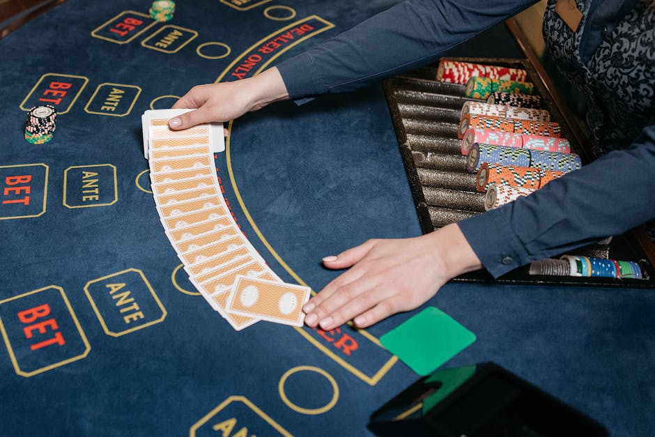
Build a small, consistent visual vocabulary. A glowing border might mean “active.” A locked icon might mean “unavailable.” A particular sound could signal that the player has committed to a choice. When the same cue means the same thing throughout the experience, the audience does less interpretation and more anticipation.
That recognition is especially useful when a format moves between platforms. A physical prop may become a simple icon on a phone, while a familiar sound or color pattern carries the identity forward. The goal is not to preserve every visual detail. It is to preserve the signals that help people understand the action.
Use timing cues to shape tension
Timing cues tell the audience how close the moment is to its deadline. They can also structure the emotional arc: first the player considers, then pressure builds, then the choice locks in. A timer is only one tool. A changing light, a narrowing progress bar, a repeated pulse, or a sound that becomes more urgent can all communicate that time is passing.
Effective cues are consistent and easy to interpret. If a bar drains from full to empty, viewers should be able to tell that the remaining time is shrinking. If a light changes color, that change should not be confused with a selected answer or a warning. One cue can carry several layers of meaning, but only when the visual system has taught the audience how to read it.
Let animation and sound cues support the choice
Animation and sound cues can make a decision feel consequential, but they work best when they reinforce information already visible on-screen. A brief highlight can show which option is active. A confirmation tone can mark a locked choice. A rising musical pulse can raise tension without obscuring the words.

Use restraint. If every option flashes, every transition whooshes, and every second has a new sound, nothing feels important. Reserve the strongest effects for meaningful beats: the countdown’s final moments, the player’s selection, and the reveal of the consequence. Keep essential information available visually, too, so viewers who cannot hear the audio still understand the action.
Timing is as important as volume. A loud sting before the player has chosen can make the moment feel like a reveal when it is still a decision. A short pause after the selection gives the audience time to register that the choice is locked before the outcome appears.
Design for phone screen constraints
A decision screen that looks elegant on a studio monitor may be unreadable on a phone. Small text, tightly packed options, and subtle color differences often disappear when the screen is reduced or viewed in a bright room. Treat phone screen constraints as a design condition from the beginning, not as a final adjustment.
- Keep the primary instruction short and large enough to read at a glance.
- Limit the number of prominent elements competing for attention.
- Leave breathing room between buttons so choices are easy to distinguish and tap.
- Use strong contrast and pair color with labels, shapes, or icons.
- Check how the screen looks on smaller devices, not just on a desktop preview.
Mobile viewers may also be watching while distracted or with the sound turned down. A countdown should therefore have a visual component, and the meaning of each option should not depend on a voice-over alone. If the player must scroll to find the final choice, or if a finger covers the selected label, the interface has made the most important moment harder than it needs to be.
Adapt the format instead of replicating the screen
When a game moves from television to a mobile interface, the tempting approach is to shrink the original screen. That is replication, not adaptation. Television can use a host’s explanation, a wide camera shot, physical movement, and a studio audience. A phone has a smaller canvas, direct touch controls, and different viewing conditions. It needs a design that respects those differences.
Adaptation means keeping the format’s recognizable identity while changing how the decision is presented. A physical button might become a large tap target. A host’s spoken explanation might become a short instruction beside the options. A studio countdown might become a progress ring paired with a gentle sound cue. The test is whether the choice still feels like part of the same experience—and whether it works naturally on the new device.
This distinction is relevant across entertainment products. A casino-style game experience associated with a company such as MrQ Casino may use conventions that feel familiar to players, but a designer should still consider the specific interface, audience, and device rather than copying a TV game-show layout. Familiar signals can help people orient themselves; they do not replace clear instructions or responsible design.
A practical checklist for the final screen
Before publishing or filming a decision moment, review it from both the player’s and the viewer’s point of view. The player needs to act confidently. The viewer needs to understand what is happening while still wondering what will happen next.
- Read the screen once. Can a first-time viewer identify the decision and the options?
- Check the stakes. Is the immediate consequence clear without giving away the eventual result?
- Test the countdown. Does the audience have time to understand before the pressure peaks?
- Mute the audio. Does the visual design still communicate the essential information?
- Reduce the screen size. Are labels, controls, and timing cues readable on a phone?
- Review the interaction. Is it obvious when a choice is selected, confirmed, and locked?
Keep the screen clear; let the outcome be uncertain
The most tense decision screens do not hide the rules. They make the rules easy to understand, then give the player a meaningful choice under pressure. Limited options reduce clutter. Strong props and cues make the format recognizable. Animation and sound cues mark important beats, while timing cues build urgency at a pace the audience can follow.
That is the balance to aim for: certainty about the decision, uncertainty about the result. When viewers can understand the choice instantly—and imagine what they would do themselves—they have room to feel the tension. The screen has done its job without getting in the way.